Loading project…


“The grenade represents power, energy, and the ability to push beyond your limits.”
This is the concept behind the Guilherme Granada brand. The design solution adopted for the project reflects the grenade and its effect in a subjective and abstract way. This is not about rough-and-tumble, direct training, since personal trainer Guilherme’s approach is geared toward gradual, personalized training based on a methodology that emphasizes effective communication with clients; by understanding their needs, weaknesses, and strengths, it is possible to tailor the ideal workout for each individual. This sets him apart from others and results in the following brand attributes: strength, determination, communication, collaboration, modernity, and professionalism.
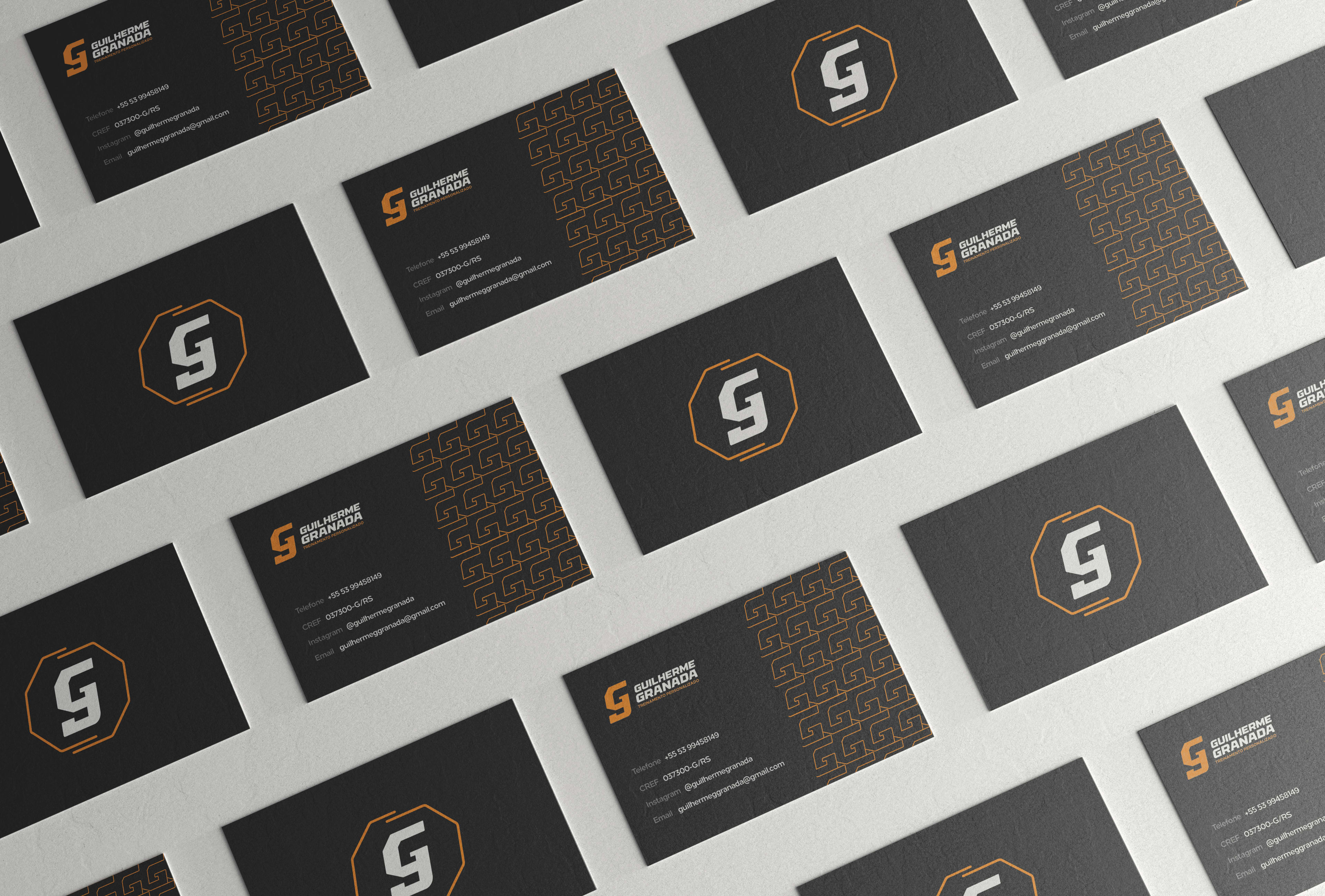
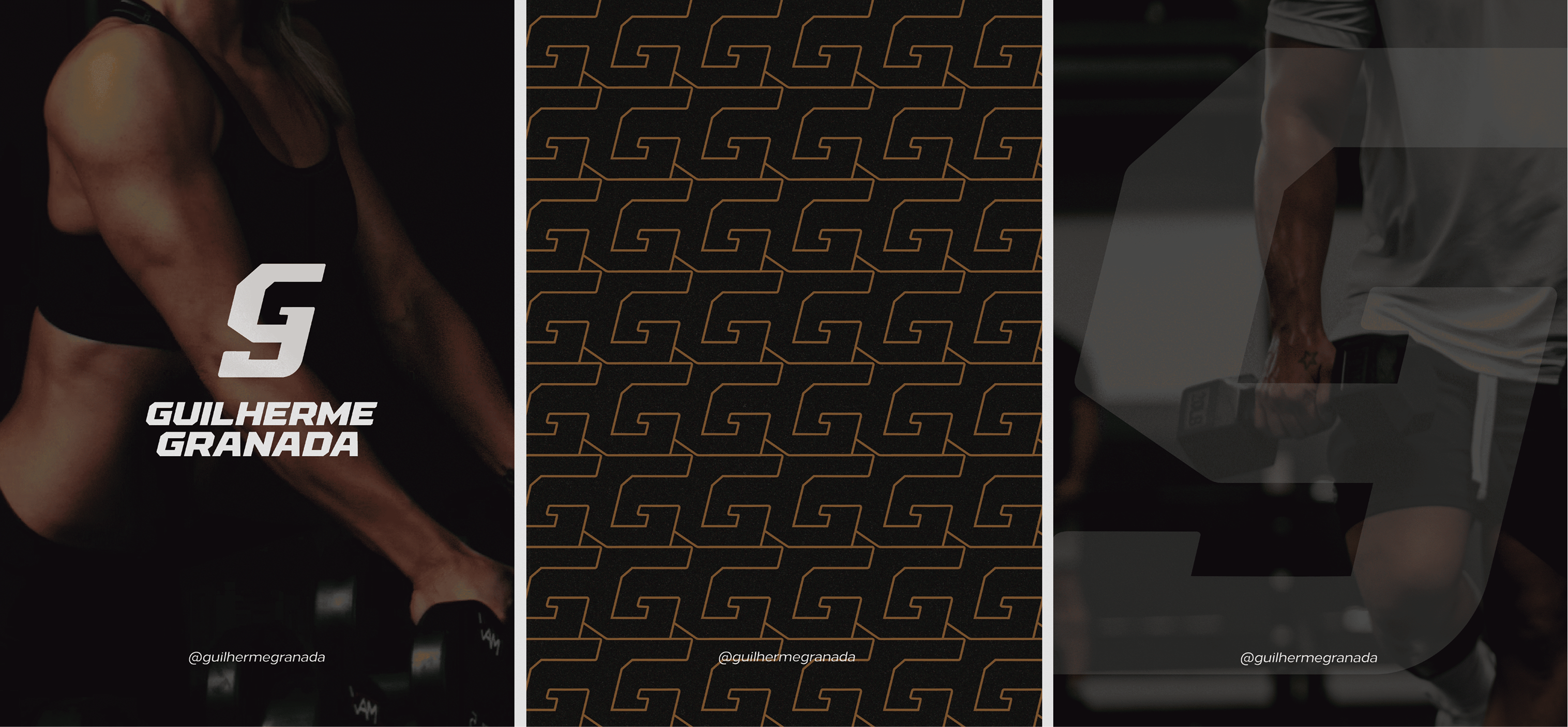
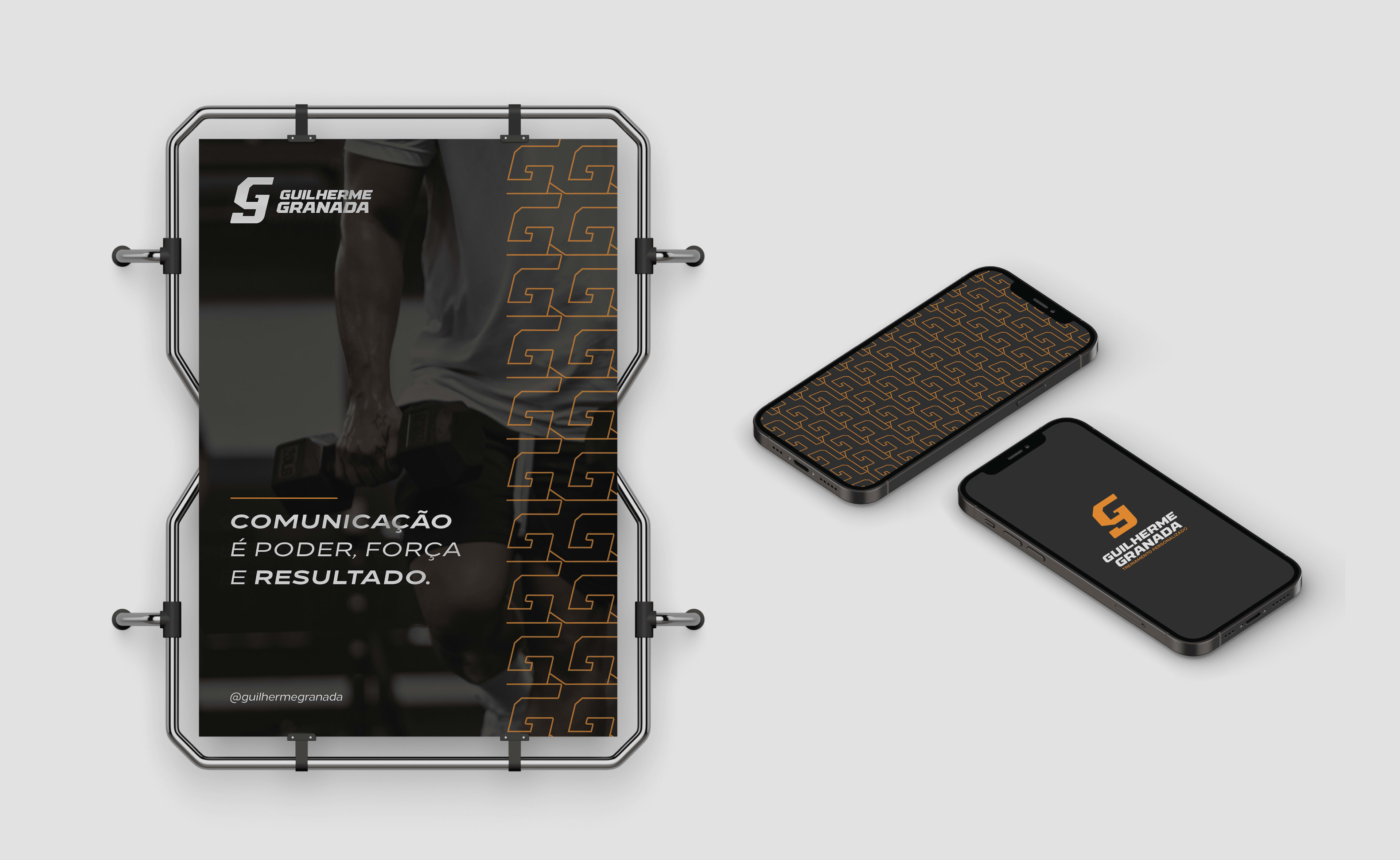
The symbol combines both “G”s from the initials of his name—one uppercase and the other lowercase. This union reflects communication and collaboration. The geometric design and the angle, meanwhile, represent strength, determination, and the very energy of the grenade, which is made explicit through the orange color incorporated into the visual identity system (VIS).
Guilherme Granada - Personal Trainer | Branding & Visual Identity | 2024






Have any project in mind?